Ruts
Client
Agency
Role
Year
Ruts
Freelancer
Senior Brand Designer
2022 - 2023

About the brand
Ruts is a brand dedicated to providing natural teethers for pets, meticulously handcrafted without preservatives or chemicals. Committed to pet health and wellness, Ruts offers safe and wholesome products that pet owners can trust. The brand focuses on quality and sustainability, ensuring that each teether is made with care and attention to detail.
My Role
As a visual designer, I played a key role in the project by developing the new logo, packaging, and content strategy for social media. My focus was on creating visually appealing designs that reflect the brand’s identity and connect with the target audience. Through this work, I aimed to enhance Ruts' overall presence and support its mission of promoting natural pet products.
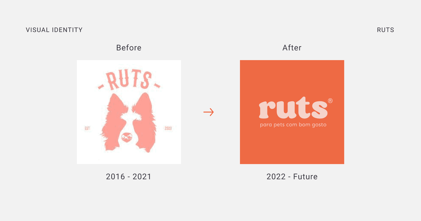
The lettering for Ruts was developed in lowercase to foster a sense of approachability and connection with the audience. The use of rounded corners evokes warmth, comfort, and the cuteness that the brand aims to convey. Additionally, bold typography enhances the brand's presence in the market, ensuring it stands out and resonates with pet owners.
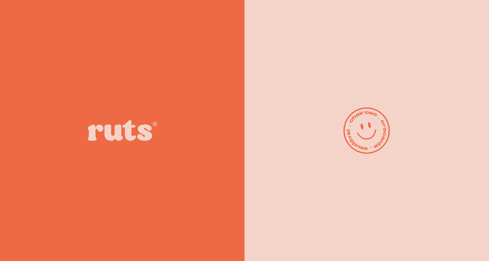


To enhance brand visibility, stickers were designed for use across various materials, including shipping and product packaging, social media, and the website. These stickers serve as a playful and engaging element, reinforcing the brand identity and encouraging customer interaction.


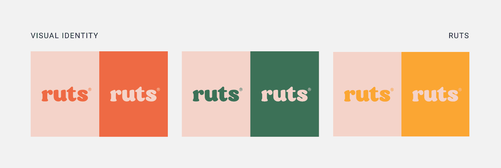
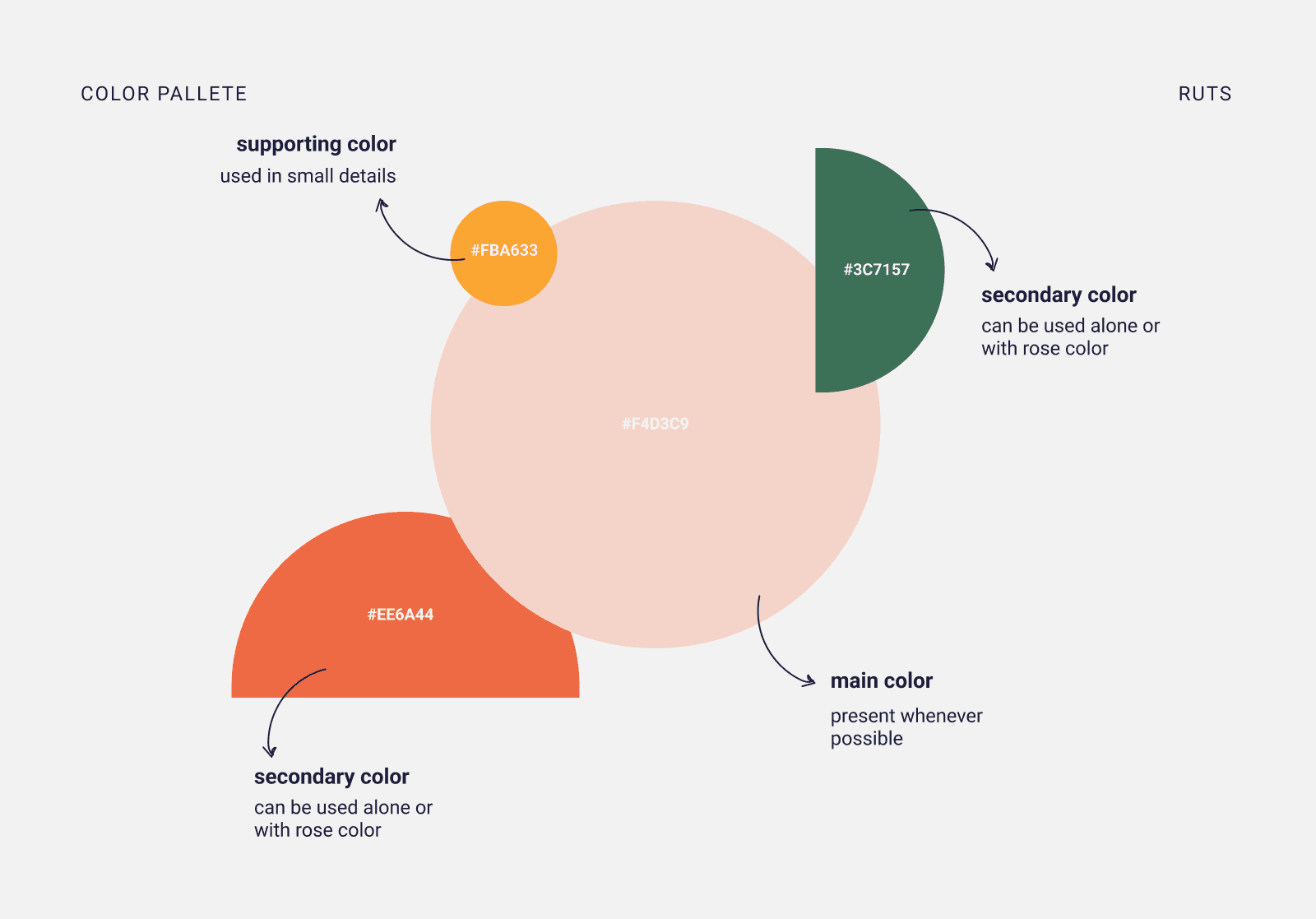
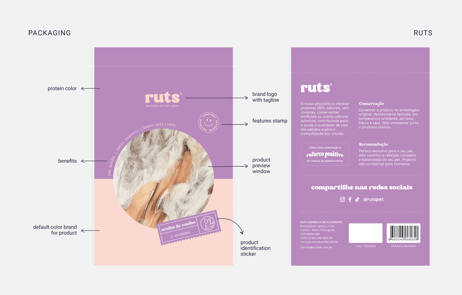
For the product packaging, three brand identity colors (red, yellow, and green) were chosen to represent the most common proteins. Additionally, three new colors were defined to symbolize special proteins, creating a vibrant and appealing palette that enhances brand recognition while highlighting the unique features of each product.


Team project:
Content Strategist - Camila Puccini
Senior Brand Designer - Camila Puccini e Geovana Montagna
Illustrator - Geovana Montagna